

Colour is used to indicate many things in real life, the most common example probably being traffic lights. This use of red, amber and green helps drivers understand the situation on the road and plan accordingly. Some people might ignore the importance of the amber light, this is not a hard and fast rule of the world and is merely advisory, this is something seen throughout video games too. Colour can be used with various applications: to indicate danger, the critical path, effectiveness and much more.

Throughout this piece I will take a look at how this has been used across multiple games and genres and highlight how these games have used colour to cut through the visual noise. Giving visual feedback to players, even when they might not have noticed it was happening.
Halo
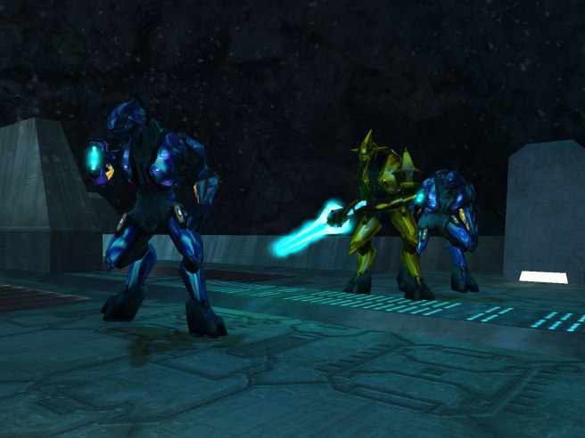
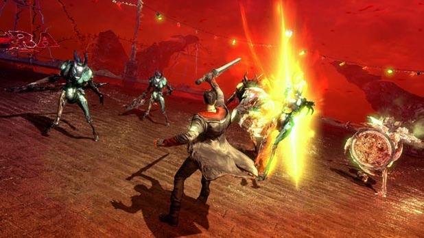
The original Halo games are a great example of how colour can be used to designate priority. One of the main examples of this is through the different, brightly coloured armour worn by the Covenant. This denotes rank among their forces, with blue Elites being weaker than red Elites. So, when entering a firefight, you know that you need to watch out for certain soldiers. Their armour is so bright that this had to be intentional, sure, the armour looks awesome in these colours, but the impact it has on the gameplay is something you probably wouldn’t even notice without stopping to think about it. This is also similar to the amber light scenario I mentioned earlier, using colour in this way is advisory, you don’t have to target certain colours first, but you will fare far better if you do so.
Now, Halo wasn’t the first time this was used in this way, many games in the old’n days used colour like this too, perhaps more due to technical limitations. With less memory available for games, it was easier to make one sprite and change the colour accordingly to assign difficulty. This would use far less cartridge space than creating two unique sprites.
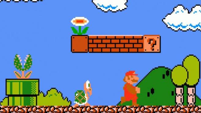
This is something employed by the original Super Mario Bros. Here you have two Koopas, one red, one green. Mario teaches you the difference between these two enemies, what their limitations are early on in the game, so you can plan your platforming accordingly. This saves on cartridge space and, like Halo, the difference is so explicit that you can differentiate between the two in even the most clutch situations.
Horizon Zero Dawn
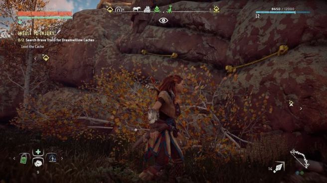
Another game where the use of colour is integral to know exactly what is going on and what your options are. All climbable objects within the game and laced with the colour yellow in some way, whether that is yellow dust, or hazard tape. This clearly indicates to the player where they are able to go and prevents trying to hop up invisible walls or impossibly slippery slopes. Whilst this may look funny in some cases, from a gameplay perspective, it drives me absolutely bonkers. So, this use of colour helps from a gameplay perspective. However, I can’t help but feel a little pulled out of the experience when you realise how much broken hazard tape there must be in this robot dinosaur infested wasteland. Why so much tape? Did we try to stop the dinosaurs roaming around with hazard tape? Give me the lore behind the hazard tape.
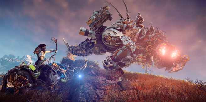
The lights present on the robots are also great indicators of the space and safe zones around you. As this game centres around stealthy movement, it is essential you know when you are visible, when you are not and the mental state of the things you are trying to sneak past. HZD does this use the many lights on the robots, with blue being blissfully unaware, orange being curious and red lights meaning you are about to get a bloody massive shard of metal shrapnel shot through your butt.
All of these elements help inform you, the player as to what is safe, what is risky, where you can go and where you can’t. Taking these colour choices out of the design would lead to an already cluttered UI being absolutely impenetrable and an absolute mess to try and play.
DMC Devil May Cry
This game uses colour a little more on the nose, similar to how Halo and Mario differentiated the enemy powers by colour, DMC does the same by changing which weapons work on each enemy, blue or red. This makes the combat more varied as you are forced to switch between your roster of weapons to dispatch certain foes.
This is something also commonly seen through Metroivania games, you need to match the colours together to make progress, yellow key opens a yellow door for example. This makes it super clear which areas can be accessed, and which cannot, it’s primitive, but if a system like this isn’t broken, why would you want to fix it?
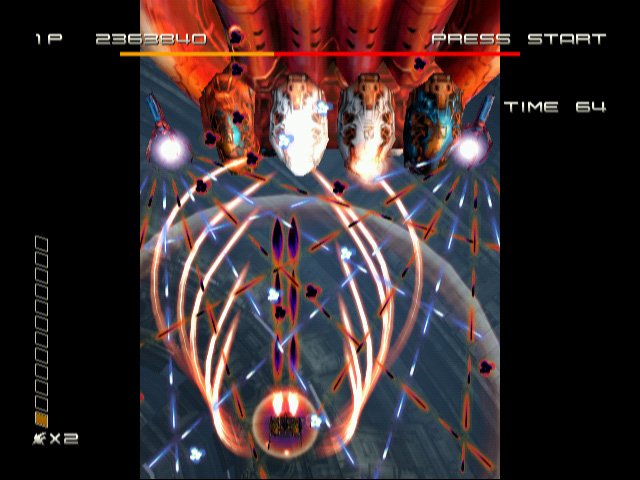
On the extreme side of this scale is the game Ikaruga which has a similar use of the colours red and blue but turns it up to 11. Try to understand this madness below. You need to be in some kind of other dimension to get through this bullet hell nightmare.
Mirror’s Edge
Here is an example of when a game uses colour to clearly denote the critical path to the player. It also helps that this is baked into the games super clean and streamlined art style, however the clear intention of this choice is to cut through the visual noise and indicate to the player clearly which elements of the environment are designed to be played around with.
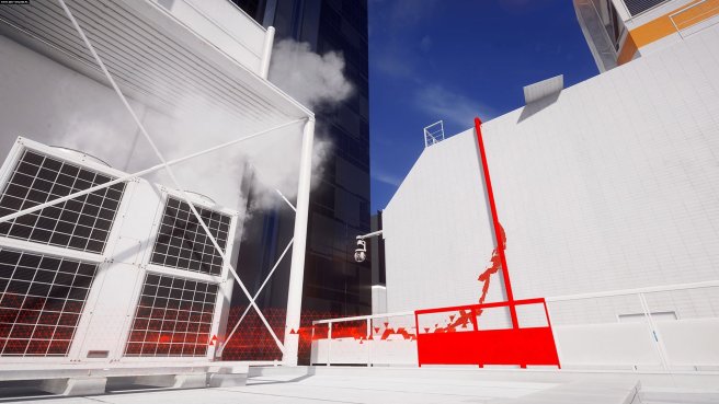
When you see a red pole is Mirror’s Edge, you know for certain that you can climb, swing, or slide down from it. This again leads to clear communication between the player and the designer, mitigating the time spent wandering around looking for where to go or which ledge to climb next. It allows the game to be focussed on what Mirror’s Edge does best, free-flowing parkour movement. Granted, other choices made by the designers hinder this, such as a heavy reliance on gunplay in later stages, but colour and visual design is never the cause of this loss of focus.
Hue
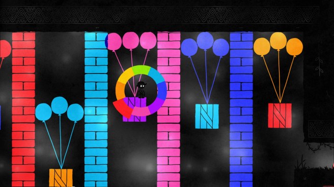
A bit on the nose with this one but I’d be daft not to include it. It is a video game. It uses colour. It’s a neat little indie title which maybe outstays it’s welcome, but the initial puzzle ideas are really cool, and it is well worth picking up if it is going cheap somewhere. The music is also super nice.
More shades than this
There are way more elements to consider, audio feedback, rumble features of the pad, even score all help feed into the experience. I haven’t even touched upon how being colour-blind can affect the experience of playing certain games. Thankfully, Insomniac have begun to rectify this by including a colour-blind option and this kind of inclusiveness is something which I’d love to see more of within the industry.
Colour should be used to clearly inform players just what can be done within the confines of the playscape and indicate the state of the world around them, how are foes likely to react and so forth. Much like great movie editing, it is only ever bad implementation which gets noticed, great implementation is seamless. The same can be said for the use of colour within video games.
